In the design world, everyone gets excited to hear about the Color of the Year.
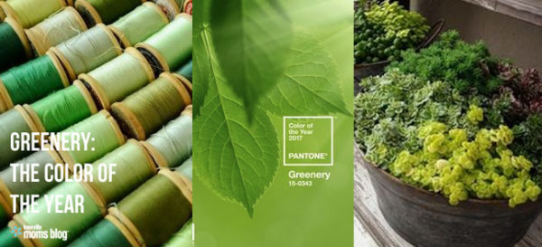
Each year, Pantone®, the recognized authority on color, selects a symbolic color which they feel is most associated with the current cultural mood and attitude in our world. The color selected for 2017 is Greenery, and Pantone® states that it is “…a fresh and zesty yellow-green shade that evokes the first days of spring when nature’s greens revive, restore and renew.” Green can be used in several ways from bold to subtle.
Here are a few ways to incorporate the color Greenery in your home:
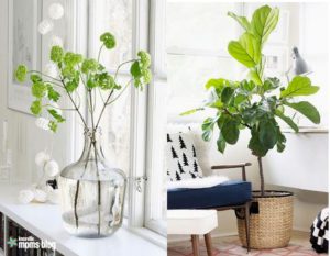
Add a touch of the color Greenery through the use of green florals or plants.
Faux Snowball flowers are a popular choice at the Shop. These are nice during the spring and summer season and look beautiful in a variety of containers. The Fiddleleaf tree has gained popularity recently and is now making an appearance in a variety of containers, but mainly woven baskets. Fiddleleafs require little care and are relatively inexpensive to purchase. Limelight Hydrangeas, Tulips, Ranunculus and Ferns are also wonderful choices for a touch of green.
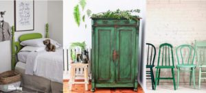
Green makes a beautiful statement on furniture.
I love using green on entry tables, side tables and chairs. My favorite green currently is Amsterdam Green Chalk Paint® by Annie Sloan which is in the featured photo in the center above. It is a rich green that pairs wonderfully with so many colors and is very fresh. The rich hue of Amsterdam Green is nice with a graphic black and white rug for a more modern look. I also love using a more subtle gray shade of green, such as Chateau Grey Chalk Paint® that plays well in more traditional settings.
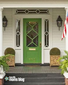
Front doors are always a great place to add a pop of color to a home.
The use of green on the door is welcoming and would be a great choice in a warm climate. When choosing an outdoor paint, be mindful of the coating you are using. Modern Masters makes a great product designed for doors.
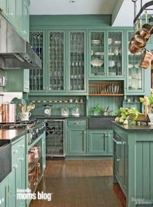
Green is beautiful in the kitchen.
It is a commitment to paint your entire kitchen green, but an island or accent piece would also work. This green has a little bit of blue in it and looks beautiful paired with soapstone counters and sinks. The warm copper pots are highlighted with the warm undertones against the green. This kitchen is timeless in color choice and design.
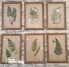
Accessories and art are an easy way to add green to the home.
The fern prints above provide a timeless look and work in a variety of locations in the home when used alone or in groups. Small vases, tea lights or throw pillows would be a simple addition, as well.


